Posts

Showing posts with the label R

My Most Popular Posts of 2017

Image
Although I've made many posts on my Data Analytics Workouts site, some generated more interest than others - nothing here was virally popular - and below are a handful of the most popular, sorted in descending order of views: Charting Correlation Matrices in R (877) Neural Networks (Part 4 of 4) - R Packages and Resources (507) Performance Improvements in R: Vectorization & Memoisation (322) Naive Bayes on Political Outcome Based on State-level Big Five Assessment (263) Decision Trees on Political Outcome Based on State-level Big Five Assessment (262) F# is Part of Microsoft's Data Science Workloads (223) Logistic Regression on Stock Data using Google and SPY (SPDR S&P 500) (196) Using Visual Studio Team Services for Personal Development (194) Microsoft Azure Notebooks - Live code - F#, R, and Python (186) Efficient R Programming - A Quick Review (178) Patents Per Capita and Hofstede's Cultural Dimensions (167) Comparing Performance in R Usin...

Code: Pinterest as a Publication Channel for Data Analytics

Image
More as an experiment, rather an attempt at sharing code and ideas, I created a Pinterest board devoted to my personal data analytics work, done with Python, R, or F#, as well as reviews of books, and was quite surprised with the result. The graphics could do with optimization, but otherwise...

Calculating Value at Risk (VaR) with Python or R

Image
The following modules linked below are based on a Pluralsight course, Understanding and Applying Financial Risk Modeling Techniques , and while the code itself is nearly verbatim, this is mostly for my own development, working through the peculiarities of Value at Risk (VaR) in both R and Python, and adding commentary as needed. The general outline of this process is as follows: Load and clean Data Calculate returns Calculate historical variance Calculate systemic, idiosyncratic, and total variance Develop a range of stress variants, e.g. scenario-based possibilities Calculate VaR as the worst case loss in a period for a particular probability The modules: In R: Financial Risk - Calculating Value At Risk (VaR) with R In Python: Financial Risk - Calculating Value At Risk (VaR) with Python

Pluralsight Courses - Opinion

My list is kind of paltry, but I’ve sat through others or started many but decided against finishing. The best courses I’ve finished have been along the lines of project management: Project Management for Software Engineers Project 2013 Fundamentals for Business Professionals I’ve also sat through this, and useful, although very rudimentary: Creating and Leading Effective Teams for Managers I do my own reading for data science, and have my own side projects, but I’ve also taken some data science courses via Pluralsight. The beginner demos are done well, although less informative than the intermediate ones, which are ultimately more useful. For the latter, I typically do simultaneous coding on my own data sets, which helps learn the material. Beginner Understanding Machine Learning Understanding Machine Learning with R Intermediate Understanding and Applying Logistic Regression (using Excel, Python, or R) Data Mining Algorithms in SSAS, Excel, and R ...

Microsoft Azure Notebooks - Live code - F#, R, and Python

I was exploring Jupyter notebooks , that combines live code, markdown and data, through Microsoft's implementation, known as MS Azure Notebooks , putting together a small library of R and F# notebooks . As Microsoft's FAQ for the service describes it as : ...a multi-lingual REPL on steroids. This is a free service that provides Jupyter notebooks along with supporting packages for R, Python and F# as a service. This means you can just login and get going since no installation/setup is necessary. Typical usage includes schools/instruction, giving webinars, learning languages, sharing ideas, etc. Feel free to clone and comment... In R Azure Workbook for R - Memoisation and Vectorization Charting Correlation Matrices in R In F# Charnownes Constant in FSharp.ipynb Project Euler - Problems 18 and 67 - FSharp using Dynamic Programming

Performance Improvements in R: Vectorization & Memoisation

Image
Full of potential coding improvements, Efficient R Programming: A Practical Guide to Smarter Programming , the book makes two suggestions that are notable. Vectorization, explained here and here , and memoisation , caching prior results albeit with additional memory use, were relevant and significant. What follows is a demonstration of the speed improvements that might be achieved using these concepts. ################################ # performance # vectorization and memoization ################################ # clear memory between changes rm(list = ls()) #load memoise #install.packages('memoise') library(memoise) # create test function monte_carlo = function(N) { hits = 0 for (i in seq_len(N)) { u1 = runif(1) u2 = runif(1) if (u1 ^ 2 > u2) hits = hits + 1 } return(hits / N) } # memoise test function monte_carlo_memo <- memoise(monte_carlo) # vectorize function monte_carlo...

Neural Networks (Part 4 of 4) - R Packages and Resources

Image
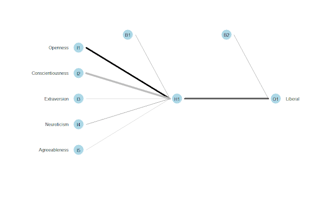
While developing these demonstrations in logistic regression and neural networks, I used and discovered some interesting methods and techniques: Better Methods A few useful commands and packages...: update.packages() for updating installed packages in one easy action as.formula() for creating a formula that I can reuse and update in one action across all my code sections View() for looking at data frames fourfoldplot() for plotting confusion matrices neuralnet for developing neural networks caret , used with nnet , to create predictive model plotnet() in NeuralNetTools, for creating attractive neural network models Resources that I used or that I would like to explore... MS Azure Notebooks , for working online with Python, R, and F#, all part of MS's data workflows Efficient R Programming , that seems to have many good tips on working with R Data Mining Algorithms in SSAS, Excel, and R , showing various algorithms in each technology R Documentation , a ...

Charting Correlation Matrices in R

Image
I noticed this very simple, very powerful article by James Marquez, Seven Easy Graphs to Visualize Correlation Matrices in R , in the Google+ community, R Programming for Data Analysis , so thought to give it a try, since I started some of my current analyses a decade ago by generating correlation matrices in Excel, which I've sometimes redone and improved in R. Some of these packages are only designed for display, or as extensions to ggplot2: corrplot: Visualization of a Correlation Matrix GGally: Extension to 'ggplot2' ggcorrplot: Visualization of a Correlation Matrix using 'ggplot2' These two are focused on more complex analysis: PerformanceAnalytics: Econometric tools for performance and risk analysis psych: Procedures for Psychological, Psychometric, and Personality Research As for data, I used Hofstede's culture dimensions, limited to developed countries. Using a broader and larger set of of countries would significantly reduce the correlation...

Decision Trees (party) on Political Outcome Based on State-level Big Five Assessment

Image
This decision tree demo is similar to a prior one I've done, but in this case, it uses the party package, that produces much higher-quality graphics than rpart, at least when used with plot. Although the idea for this analysis is mine, this was done as part of work for a Pluralsight training presentation, Data Mining Algorithms in SSAS, Excel, and R . Source data is here . # # Load Data # # Set working directory setwd("../Data") getwd() # read from data frame BigFivByState.df <- read.table("BigFiveScoresByState.csv", header = TRUE, sep = ",") # # Run Analysis # # Load package, install.packages('party', dependencies = TRUE) library(party) # train the model BigFivByState.dt <- ctree(data = BigFivByState.df, Liberal ~ Openness + Conscientiousness + Extraversion + Neuroticism + Agreeableness) # plot result plot(BigFivByState.dt, uniform = TRUE, main = ...

Naive Bayes on Political Outcome Based on State-level Big Five Assessment

Image
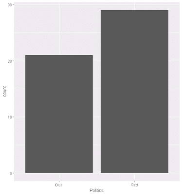
As part of another Pluralsight training presentation, Data Mining Algorithms in SSAS, Excel, and R , I worked through various exercises, and from that I've adapated Naive Basyes to one of my existing data sets. The code is below, as are some related graphs. Overall, the percent correct predicted based on Big Five personality traits using the Naive Bayes calculation is 66%. Source data is here . # # Load & Explore Data # # read from data frame BigFivByState.df <- read.table("BigFiveScoresByState.csv", header = TRUE, sep = ",") # review data head(BigFivByState.df) nrow(BigFivByState.df) summary(BigFivByState.df) names(BigFivByState.df) # various aggregations # as "count this value" ~ grouped by this + this Liberal.dist <- aggregate(State ~ Liberal, data = BigFivByState.df, FUN = length) head(Liberal.dist) RedBlue.dist <- aggregate(State ~ Politics, data = BigFivByState.df, FU...

Logistic Regression on Stock Data using Google and SPY (SPDR S&P 500)

As part of a Pluralsight training presentation, Understanding and Applying Logistic Regression , students worked through various exercises, one of which was predicting stock price changes, up or down, on Google, using Google and Spyder closing prices. As an ordered list of actions: Load data - Yahoo financials for each day for 5 years, taking only date and closing price for this analysis Transform sources: Merge sources, change column headings, cast the Date column as DATE type, sort descending Perform logistic regression Create a frame of actual versus predicted changes, and add a column for the correct/incorrect prediction result Find percent correct, on whether the price moved correctly up or down As a result, the lagged Google and SPY prices accurately predict next day prices about 63% of the time. Source data is here . # Clear memory rm(list = ls()) # Set working directory setwd("../Data") getwd() # load data # Data is Yahoo finan...

Patents Per Capita and Hofstede's Cultural Dimensions

Image
Thinking about social dimensions and innovation, it occurred to me that there might be a relationship with masculinity, but then quickly dismissed it, considering it much more likely to be predicated on science/math education. Even then, other cultural elements might be more likely correlated. What follows is an exploration of various correlations with patents per capita. Although Hofstede's Cultural Dimensions did have a significant correlation with patents per capita, somewhat surprisingly, PISA scores by country, education, nor average IQ, had a strong relationship with patent production, although if Asia was included, statistically it would. Notes: I often exclude Asia from analyses, as the initial driver of this work was looking at cultures that are similar, to tease out social effects. That is also why I ignore looking at all countries, as some relationships across the entire world disappear when limited to just developed economies. As an example, the value of work and...

Hofstede's Long-term Orientation and Individuality: Obesity Relationships (using R)

Image
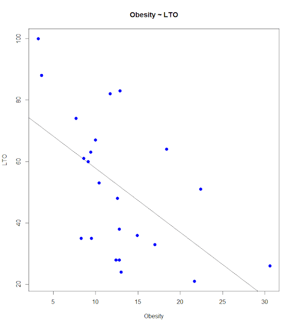
Hofstede extended his original four dimensions, adding measures Long-Term Orientation (LTO) and Indulgence (Ind) in response to other researchers studies. While reading Hofstede's Cultures and Organizations: Software of the Mind, Third Edition I was struck by the lackluster reporting of the correlation between obesity and indulgence. It seemed obvious one would delve a bit further, maybe looking at a compound relationship between both indulgence and LTO, e.g., does short-sightedness and indulgence lead to obesity. Although I limit my analysis to OECD countries, that is what I present here. An explanation of dimensions can be found on Hofstede's site. Hofstede's Dimensions and Obesity A first step would be to see what relationships exist between obesity and the dimensions: 1: # LM - Multiple Regression - New Hofstede, LTO and Ind 2: # Load the data into a matrix 3: rm(list = ls()) 4: setwd("../Data") 5: oecdData <- read.table("OECD ...

Inequality and Religiosity: The Gini ~ Religion Matters Vector, with Correlations and Plot

Image
Responses to a post on the correlation between country-average IQ and responding yes to a question on if religion matters are inversely correlated, but not strongly so, prompted me to dig up a more significant issue, the relationship between religiosity and inequality, as measured by the Gini coefficient. The correlation is quite high, at about .7, although this really says nothing about the cause, if religious countries tend toward inequality because of general tendencies, or if inequality drives people to religion, as a salve against suffering. In truth, they could both be reflective of some other aspect of a country, and not in any way causative. Example Code # Correlations on ReligionMatters and Gini Coeficients oecdData <- read.table("OECD - Quality of Life.csv", header = TRUE, sep = ",") #names(oecdData) religionMattersVector <- oecdData$ReligionMatters giniVector <- oecdData$Gini cor.test(giniVector, religionMattersVect...

Decision Tree in R, with Graphs: Predicting State Politics from Big Five Traits

Image
This was a continuation of prior explorations, logistic regression predicting Red/Blue state dichotomy by income or by personality. This uses the same five personality dimensions, but instead builds a decision tree. Of the Big Five traits, only two were found to useful in the decision tree, conscientiousness and openness. Links to sample data, as well as to source references, are at the end of this entry. Example Code # Decision Tree - Big Five and Politics library("rpart") # grow tree input.dat <- read.table("BigFiveScoresByState.csv", header = TRUE, sep = ",") fit <- rpart(Liberal ~ Openness + Conscientiousness + Neuroticism + Extraversion + Agreeableness, data = input.dat, method="poisson") # display the results printcp(fit) # visualize cross-validation results plotcp(fit) # detailed summary of splits summary(fit) # plot tree plot(fit, uniform = TRUE, main = "Class...

Plotting Text Frequency and Distribution using R for Spinoza's A Theological-Political Treatise [Part I]

Image
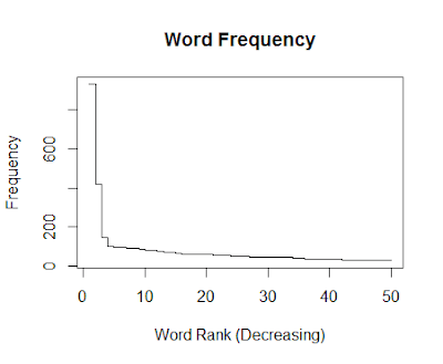
This was a little bit of fun, after reading a few more chapters of Text Analysis with R for Students of Literature . Spinoza is a current interest, as I am also reading Radical Enlightenment: Philosophy and the Making of Modernity 1650-1750 . Example Code (Common to Subsections) # Text for this can be acquired as below Project Gutenberg, as below # http://www.gutenberg.org/cache/epub/989/pg989.txt, # or via a Sample Data at the end of this post: textToRead = 'pg989.txt' # Text for this can be acquired via Matthew Jockers site, as below, # http://www.matthewjockers.net/macroanalysisbook/expanded-stopwords-list/, # or via a Sample Data at the end of this post: exclusionFile = 'StopList_Extended.csv' # Read Text text.scan <- scan(file = textToRead, what = 'char') text.scan <- tolower(text.scan) # Create list text.list <- strsplit(text.scan, '\\W+', perl = TRUE) text.vector <- unlist(text.list) # Create ...

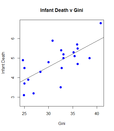
Inequality Kills: Correlation, with Graph and Least Square, of Gini Coefficient (Inequality) and Infant Death

Image
At a correlation approaching 0.7, the relationship between infant mortality and inequality is quite high. One can argue causality, but the existence of the relationship, and there are others of varying magnitude, is a powerful indictment: Example Code oecdData <- read.table("OECD - Quality of Life.csv", header = TRUE, sep = ",") gini.v <- oecdData$Gini death.v <- oecdData$InfantDeath cor.test(gini.v, death.v) plot(gini.v, death.v, col = "blue", main = "Infant Death v Gini" , abline(lm(death.v ~ gini.v)) , cex = 1.3, pch = 16, xlab = "Gini", ylab = "Infant Death") Example Results Pearson's product-moment correlation data: gini.v and death.v t = 4.2442, df = 19, p-value = 0.0004387 alternative hypothesis: true correlation is not equal to 0 95 percent confidence interval: 0.3805316 0.8679275 sample estimates: cor 0.69762 Example Graph Sample ...

Python Tools for Visual Studio

Image
I recently finished a tutorial I was working through in R - I have certainly not exhausted exploring R, just taking time to let it settle in - and am thinking of working with Python for a while. That would include using  Python Tools for Visual Studio :

Chi-Square in R on by State Politics (Red/Blue) and Income (Higher/Lower)

This is a significant result, but instead of a logistic regression looking at the income average per state and the likelihood of being a Democratic state, it uses Chi-Square. Interpreting this is pretty straightforward, in that liberal states typically have cities and people that earn more money. When using adjusted incomes, by cost of living, this difference disappears. Example Code # R - Chi Square rm(list = ls()) stateData <- read.table("CostByStateAndSalary.csv", header = TRUE, sep = ",") # Create vectors affluence.median <- median(stateData$Y2014, na.rm = TRUE) affluence.v <- ifelse(stateData$Y2014 > affluence.median, 1, 0) liberal.v <- stateData$Liberal # Solve pol.Data = table(liberal.v, affluence.v) result <- chisq.test(pol.Data) print(result) print(pol.Data) Example Results Pearson's Chi-squared test with Yates' continuity correction data: pol.Data X-squared = 12.672, ...

Logistic Regression in R on State Voting in National Elections and Income

This data set - a link is at the bottom - is slightly different, income by state and political group, red or blue. Generally, residents of blue states have higher incomes, although not when adjusted for cost of living: Example Code # R - Logistic Regression stateData <- read.table("CostByStateAndSalary.csv", header = TRUE, sep = ",") am.data = glm(formula = Liberal ~ Y2014, data = stateData, family = binomial) print(summary(am.data)) Example Results Call: glm(formula = Liberal ~ Y2014, family = binomial, data = stateData) Deviance Residuals: Min 1Q Median 3Q Max -2.4347 -0.7297 -0.4880 0.6327 1.8722 Coefficients: Estimate Std. Error z value Pr(>|z|) (Intercept) -9.325e+00 2.671e+00 -3.491 0.000481 *** Y2014 1.752e-04 5.208e-05 3.365 0.000765 *** --- Signif. codes: 0 ‘***’ 0.001 ‘**’ 0.01 ‘*’ 0.05 ‘.’ 0.1 ‘ ’ 1 (Dispersion parameter for...