Posts

Showing posts with the label statistics

My Most Popular Posts of 2017

Image
Although I've made many posts on my Data Analytics Workouts site, some generated more interest than others - nothing here was virally popular - and below are a handful of the most popular, sorted in descending order of views: Charting Correlation Matrices in R (877) Neural Networks (Part 4 of 4) - R Packages and Resources (507) Performance Improvements in R: Vectorization & Memoisation (322) Naive Bayes on Political Outcome Based on State-level Big Five Assessment (263) Decision Trees on Political Outcome Based on State-level Big Five Assessment (262) F# is Part of Microsoft's Data Science Workloads (223) Logistic Regression on Stock Data using Google and SPY (SPDR S&P 500) (196) Using Visual Studio Team Services for Personal Development (194) Microsoft Azure Notebooks - Live code - F#, R, and Python (186) Efficient R Programming - A Quick Review (178) Patents Per Capita and Hofstede's Cultural Dimensions (167) Comparing Performance in R Usin...

Code: Pinterest as a Publication Channel for Data Analytics

Image
More as an experiment, rather an attempt at sharing code and ideas, I created a Pinterest board devoted to my personal data analytics work, done with Python, R, or F#, as well as reviews of books, and was quite surprised with the result. The graphics could do with optimization, but otherwise...

Data Mining for Fund Raisers: How to Use Simple Statistics to Find the Gold in Your Donor Database Even If You Hate Statistics: A Starter Guide

Image
This is a repost of a Goodreads' review I made in 2013, for a book I read in 2005, which seems relevant now, as the industry is adding a data-driven focus. Plus, the world is now being transformed by advances in artificial intelligence and machine learning (AI/ML), particularly deep learning, and the large data sets and complexity of donor actions should greatly benefit from analysis. Note, the tax changes for 2018 and beyond will increase the importance of major donors, attenuating the benefits of AI/ML, as data for high-net-worth individuals is sparse. Data Mining for Fund Raisers: How to Use Simple Statistics to Find the Gold in Your Donor Database Even If You Hate Statistics: A Starter Guide by Peter B. Wylie My rating: 4 of 5 stars My spouse, at times a development researcher of high-net worth individuals, was given this book because she was the 'numbers' person in the office. Since my undergraduate was focused on lab-design, including analysis of results using ...

Comparing Performance in R Using Microbenchmark

Image
This post is a very simple display of how to use microbenchmark in R . Other sites might have longer and more detailed posts , but this post is primarily to 'spread the word' about this useful function, and show how to plot it. An alternative version of this post exists in Microsoft's Azure Notebooks, as Performance Testing Results with Microbenchmark Load Libraries Memoise as part of the code to test, microbenchmark to show usage, and ggplot2 to plot the result. library(memoise) library(microbenchmark) library(ggplot2) Create Functions Generate several functions with varied performance times, a base function plus functions that leverage vectorization and memoisation. # base function monte_carlo = function(N) { hits = 0 for (i in seq_len(N)) { u1 = runif(1) u2 = runif(1) if (u1 ^ 2 > u2) hits = hits + 1 } return(hits / N) } # memoise test function monte_carlo_memo <- memoise(mon...

Charting Correlation Matrices in R

Image
I noticed this very simple, very powerful article by James Marquez, Seven Easy Graphs to Visualize Correlation Matrices in R , in the Google+ community, R Programming for Data Analysis , so thought to give it a try, since I started some of my current analyses a decade ago by generating correlation matrices in Excel, which I've sometimes redone and improved in R. Some of these packages are only designed for display, or as extensions to ggplot2: corrplot: Visualization of a Correlation Matrix GGally: Extension to 'ggplot2' ggcorrplot: Visualization of a Correlation Matrix using 'ggplot2' These two are focused on more complex analysis: PerformanceAnalytics: Econometric tools for performance and risk analysis psych: Procedures for Psychological, Psychometric, and Personality Research As for data, I used Hofstede's culture dimensions, limited to developed countries. Using a broader and larger set of of countries would significantly reduce the correlation...

Decision Trees (party) on Political Outcome Based on State-level Big Five Assessment

Image
This decision tree demo is similar to a prior one I've done, but in this case, it uses the party package, that produces much higher-quality graphics than rpart, at least when used with plot. Although the idea for this analysis is mine, this was done as part of work for a Pluralsight training presentation, Data Mining Algorithms in SSAS, Excel, and R . Source data is here . # # Load Data # # Set working directory setwd("../Data") getwd() # read from data frame BigFivByState.df <- read.table("BigFiveScoresByState.csv", header = TRUE, sep = ",") # # Run Analysis # # Load package, install.packages('party', dependencies = TRUE) library(party) # train the model BigFivByState.dt <- ctree(data = BigFivByState.df, Liberal ~ Openness + Conscientiousness + Extraversion + Neuroticism + Agreeableness) # plot result plot(BigFivByState.dt, uniform = TRUE, main = ...

Naive Bayes on Political Outcome Based on State-level Big Five Assessment

Image
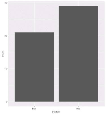
As part of another Pluralsight training presentation, Data Mining Algorithms in SSAS, Excel, and R , I worked through various exercises, and from that I've adapated Naive Basyes to one of my existing data sets. The code is below, as are some related graphs. Overall, the percent correct predicted based on Big Five personality traits using the Naive Bayes calculation is 66%. Source data is here . # # Load & Explore Data # # read from data frame BigFivByState.df <- read.table("BigFiveScoresByState.csv", header = TRUE, sep = ",") # review data head(BigFivByState.df) nrow(BigFivByState.df) summary(BigFivByState.df) names(BigFivByState.df) # various aggregations # as "count this value" ~ grouped by this + this Liberal.dist <- aggregate(State ~ Liberal, data = BigFivByState.df, FUN = length) head(Liberal.dist) RedBlue.dist <- aggregate(State ~ Politics, data = BigFivByState.df, FU...

Logistic Regression on Stock Data using Google and SPY (SPDR S&P 500)

As part of a Pluralsight training presentation, Understanding and Applying Logistic Regression , students worked through various exercises, one of which was predicting stock price changes, up or down, on Google, using Google and Spyder closing prices. As an ordered list of actions: Load data - Yahoo financials for each day for 5 years, taking only date and closing price for this analysis Transform sources: Merge sources, change column headings, cast the Date column as DATE type, sort descending Perform logistic regression Create a frame of actual versus predicted changes, and add a column for the correct/incorrect prediction result Find percent correct, on whether the price moved correctly up or down As a result, the lagged Google and SPY prices accurately predict next day prices about 63% of the time. Source data is here . # Clear memory rm(list = ls()) # Set working directory setwd("../Data") getwd() # load data # Data is Yahoo finan...

Exercises: Computational Statistics in Python - Introduction to Python

To prepare for further exploration in data analytics, and give myself some time to absorb R, I decided to work in Python for a while. For this, I worked through Computational Statistics in Python module Introduction to Python . These are some of the code produced to solve the exercises: # Tutorial Answers """http://people.duke.edu/~ccc14/sta-663/IntroductionToPythonSolutions.html""" """1. Solve the FizzBuzz problem “Write a program that prints the numbers from 1 to 100. But for multiples of three print “Fizz” instead of the number and for the multiples of five print “Buzz”. For numbers which are multiples of both three and five print “FizzBuzz”.""" def fizz_buzz(begin, end): """Write a program that prints the numbers from 1 to 100. But for multiples of three print “Fizz” instead of the number and for the multiples of five print “Buzz”. For numbers which are multi...

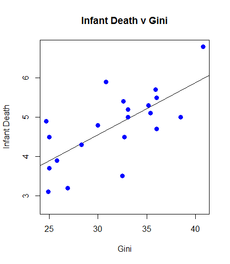
Inequality Kills: Correlation, with Graph and Least Square, of Gini Coefficient (Inequality) and Infant Death

Image
At a correlation approaching 0.7, the relationship between infant mortality and inequality is quite high. One can argue causality, but the existence of the relationship, and there are others of varying magnitude, is a powerful indictment: Example Code oecdData <- read.table("OECD - Quality of Life.csv", header = TRUE, sep = ",") gini.v <- oecdData$Gini death.v <- oecdData$InfantDeath cor.test(gini.v, death.v) plot(gini.v, death.v, col = "blue", main = "Infant Death v Gini" , abline(lm(death.v ~ gini.v)) , cex = 1.3, pch = 16, xlab = "Gini", ylab = "Infant Death") Example Results Pearson's product-moment correlation data: gini.v and death.v t = 4.2442, df = 19, p-value = 0.0004387 alternative hypothesis: true correlation is not equal to 0 95 percent confidence interval: 0.3805316 0.8679275 sample estimates: cor 0.69762 Example Graph Sample ...