Clustering: Hierarchical and K-Means in R on Hofstede Cultural Patterns
Overview
What follows is an exploration of clustering, via hierarchies and K-Means, using the Hofstede patterns data, available from my Public folder.For a deeper understanding of clustering and the various related techniques I suggest the following:
Load Data
 # load data
 Hofstede.df.preclean <- read.csv("HofstedePatterns.csv", na.strings = c("", "NA"))
 #nrow(Hofstede.df.preclean)

 # remove NULLs
 Hofstede.df.preclean <- na.omit(Hofstede.df.preclean)
 #nrow(Hofstede.df.preclean)

 Hofstede.df <- Hofstede.df.preclean
Hierarchical Clustering
Run hclust, Generate Dendrogram
The first attempt is the simplest analysis using the dist() and hclust() functions to generate a hierarchy of grouped data. The cluster size is derived from a reading of the dendrogram, although there are automated ways of selecting the cluster number, shown further along in this demo.. Hofstede.dist <- dist(Hofstede.df, method = "euclidean")
Hofstede.hClustModel <- hclust(Hofstede.dist, method = "ward.D2")
hClust.plot <- plot(Hofstede.hClustModel)

Select the Number of Cuts
You can asses the diagram visually, noting the heights and decide the clustering. In this case I've chosen 10 clusters, which the code overlays on the dendrogram. Hofstede.dist <- dist(Hofstede.df, method = "euclidean")
Hofstede.hClustModel <- hclust(Hofstede.dist, method = "ward.D2")
hClust.plot <- plot(Hofstede.hClustModel)
kClusters <- 10
Hofstede.hClustModel.groups <- cutree(Hofstede.hClustModel, k = kClusters)
rect.hclust(Hofstede.hClustModel, k = kClusters, border = "red")

Join
After clustering, the source data is joined with the grouping from the cluster model, so it can then be analyzed. A side note, the data can also be exported to CSV for analysis in other tools. In this case, I conducted some rudimentary analysis in Excel, forming pivot tables off the cluster groups to assess the validity of the grouping. # join data against grouping
Hofstede.hclust.combined <- as.data.frame(cbind(Hofstede.hClustModel.groups, Hofstede.df))
#head(Hofstede.hclust.combined)
Results
The statements below output the groupings, and immediately one can see the similarities within the groups. They are grouped numerically, but obvious relationships show between countries, their regions and their cultures, even though the data does not contain specific categorization for either region or culture. # review data, natively
#(Hofstede.hclust.combined[Hofstede.hclust.combined$Hofstede.hClustModel.groups == 1,])
(Hofstede.hclust.combined[Hofstede.hclust.combined$Hofstede.hClustModel.groups == 2,])
#(Hofstede.hclust.combined[Hofstede.hclust.combined$Hofstede.hClustModel.groups == 3,])
#(Hofstede.hclust.combined[Hofstede.hclust.combined$Hofstede.hClustModel.groups == 4,])
(Hofstede.hclust.combined[Hofstede.hclust.combined$Hofstede.hClustModel.groups == 5,])
(Hofstede.hclust.combined[Hofstede.hclust.combined$Hofstede.hClustModel.groups == 6,])
(Hofstede.hclust.combined[Hofstede.hclust.combined$Hofstede.hClustModel.groups == 7,])
#(Hofstede.hclust.combined[Hofstede.hclust.combined$Hofstede.hClustModel.groups == 8,])
#(Hofstede.hclust.combined[Hofstede.hclust.combined$Hofstede.hClustModel.groups == 9,])
#(Hofstede.hclust.combined[Hofstede.hclust.combined$Hofstede.hClustModel.groups == 10,])

K-Means
Example 1
There are different ways of calculating K-Means, of which I work through two examples, the second having more refined graphs, as well as a vectorized equation for finding the elbow. set.seed(20)
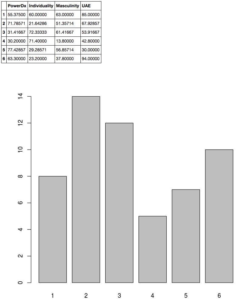
Hofstede.kMean <- kmeans(Hofstede.df[,2:5], 6, nstart = 20)
Hofstede.kMean$centers
plot(Hofsted.plot <- as.factor(Hofstede.kMean$cluster))
In the resulting output, the first shows the clusters' averages, and the second shows the count of countries per cluster.
Plot Partial Two-dimensional result
There are interesting plot types for displaying multi-dimensional results, which I hope to explore in later analyses, but for this review I am limiting myself to just a two-dimensional plot, seen below. Hofsted.plot <- as.factor(Hofstede.kMean$cluster)
library(ggplot2)
ggplot(Hofstede.df, aes(Individuality, Masculinity, color = Hofsted.plot)) + geom_point()

Example 2
Determine Clusters - Find the 'elbow'
Rather than visually estimating the number of clusters, there are programmatic techniques, two of which I explore below. Essentially, look for where the curve flattens, past which further clustering is assumed to be less informative.Finding the Elbow - Version 1
 Hofstede.scaled <- scale(Hofstede.df[, 2:5])
 wss <- (nrow(Hofstede.scaled) - 1) * sum(apply(Hofstede.scaled, 2, var))
 for (i in 2:20)
   wss[i] <- sum(kmeans(Hofstede.scaled, centers = i)$withinss)
   plot(1:20, wss, type = "b", xlab = "Number of Clusters", ylab = "Within groups sum of squares")
 wss <- NA

Finding the Elbow - Version 2
In the following code, the equation for calculatng clusters is both vectorized and uses piping, similar to lambda notation. install.packages(c('broom','magrittr'), dependencies = TRUE)
library(broom)
library(magrittr)
kclusts <- NA
temp.df <- Hofstede.df[, 2:5]
kclusts <- data.frame(k = 1:20) %>% group_by(k) %>% do(kclust = kmeans(temp.df, .$k))
clusterings <- kclusts %>% group_by(k) %>% do(glance(.$kclust[[1]]))
library(ggplot2)
ggplot(clusterings, aes(k, tot.withinss)) + geom_line()

Set Clusters
Depending on the elbow - the graphs seem to change on each run - one can choose how many clusters would be optimal. in this case, I chose 6. # set clusters
kClusters = 6
# K-Means Cluster Analysis
Hofstede.scaled.fit <- kmeans(Hofstede.scaled, kClusters)
# get cluster means
aggregate(Hofstede.scaled, by = list(Hofstede.scaled.fit$cluster), FUN = mean)
# append cluster assignment
Hofstede.scaled.combined <- data.frame(Hofstede.scaled.fit$cluster, Hofstede.scaled)
#plot(Hofstede.scaled, col = (Hofstede.scaled.fit$cluster + 1), main = "K-Means result with 6 clusters", pch = 20, cex = 2)
Hofstede.scaled.fit.centers <- as.data.frame(Hofstede.scaled.fit$centers)
library(ggplot2)
centerColor <- 'Blue'
plot <- ggplot(Hofstede.scaled.combined, aes(x = Individuality, y = Masculinity, color = Hofstede.scaled.fit$cluster)) + geom_point()
plotWithCenter1 <- plot + geom_point(data = Hofstede.scaled.fit.centers, aes(x = Individuality, y = Masculinity), color = centerColor)
plotWithCenter1 + geom_point(data = Hofstede.scaled.fit.centers, aes(x = Individuality, y = Masculinity), color = centerColor, size = 80, alpha = .3)

Analyze categorizations in Excel
An alternative means of analysis is Excel, which is great for easy slicing and dicing of data, and the code below uses the rio library to output to CSV. # append cluster assignment
Hofstede.df.combined <- data.frame(Hofstede.df, Hofstede.scaled.fit$cluster)
#head(Hofstede.df.combined)
# export dasta
#install.packages("rio", dependencies = TRUE)
library(rio)
export(Hofstede.df.combined, "Hofstede.df.combined.csv")


Comments
Post a Comment