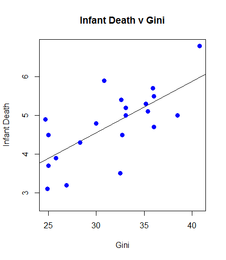
Inequality Kills: Correlation, with Graph and Least Square, of Gini Coefficient (Inequality) and Infant Death
At a correlation approaching 0.7, the relationship between infant mortality and inequality is quite high. One can argue causality, but the existence of the relationship, and there are others of varying magnitude, is a powerful indictment:
Example Code
Example Results
Example Graph
Sample Data
Example Code
 oecdData <- read.table("OECD - Quality of Life.csv", header = TRUE, sep = ",")
 gini.v <- oecdData$Gini
 death.v <- oecdData$InfantDeath
 cor.test(gini.v, death.v)
 plot(gini.v, death.v, col = "blue", main = "Infant Death v Gini"
 , abline(lm(death.v ~ gini.v))
 , cex = 1.3, pch = 16, xlab = "Gini", ylab = "Infant Death")
Example Results
 Pearson's product-moment correlation

 data: gini.v and death.v
 t = 4.2442, df = 19, p-value = 0.0004387

 alternative hypothesis: true correlation is not equal to 0

 95 percent confidence interval:
  0.3805316 0.8679275

 sample estimates:

   cor
   0.69762
Example Graph

Sample Data


Comments
Post a Comment